5 Ways to Personalize Your Squarespace Design
One of the smartest things I ever did to streamline my business was switching my website over to Squarespace a few years back.
I bought into the lie that to be professional, you have to use Wordpress for your website so I used it for years even though I truly hated it. I know that seems extreme but it wasted so much of my time and could be so frustrating!
When you’re running a business strictly during your kids’ nap time, the last thing you want to do is spend that limited time researching website problems.
As a graphic designer, I really just wanted to have a beautiful website where things worked all the time. At that time I was also doing a lot of branding for clients and wanted to help design beautiful websites for them as well.
But on Wordpress, even with knowing some CSS and using some of the highest rated themes, there were always headaches. I’d spend hours researching what updates I needed to make or what code to add when things didn’t work how they were supposed to.
Finally, I had enough and decided I was switching to Squarespace!
Fast forward to a few years later and I still have yet to have any problems.
Everything just works the way it’s supposed to - no updates, no errors, no weird messages.
I can redesign my website in a matter of hours, not weeks.
All of the themes are beautiful and professional, but being a designer, I love adding in customizations and visual tweaks just for fun.
So I thought I’d share some of my favorite ways to change up my Squarespace design and give you an idea of what can be done.
Plus you don’t have to know any coding at all!
(Note: Some of these tweaks may work differently depending on your template family. I use the Basil template but anything in the Brine family should work similarly.)
Here we go….
5 Ways To Personalize Your Squarespace Design
#1 Overlapping Images Effect
Creating some dimension on the homepage instead of the usual hero image or slider at the top can add so much interest and personality to your site.
You could design a collage in Photoshop or Canva, but the downside of doing that is the mobile version would be really tiny. So another way to make it work is experiment with overlapping images.
Set up your home page as an Index so that each section is its own page with its own banner (background) image.
Then click on the Settings Gear > Media to upload an image for the background. You can see the background image I uploaded here as an example.
Then you’ll actually go in and edit that page to add another overlapping image. If you’d like it to have text or a button, in the image settings you can go to Design > Collage and Image Link>Button.
I had to play around with the spacing and sizing to show more of my background image. To do this in your main sidebar go to Design > Site Styles and then click on this text area or search for Image Block:Collage. You’ll see all of these settings pop up.
#2 Solid Color Backgrounds
Another way to personalize your template is to divide up your sections with solid colored backgrounds.
I love the movement you get of images scrolling over the solid color background. You’ll do exactly what you did before in step one using an Index with each section as its own page. Except this time, you’ll upload a solid color background instead of an image as the banner.
You can add multiple images or text blocks over the top of this. But if you want them to scroll over the background, you’ll need to make sure Parallax is enabled. To do this, go to Design > Site Styles and search for Parallax to see the settings and make sure it’s enabled.
#3 Play Around With Spacers.
I’m not sure why it took my so long to use my spacers but I almost never used them until recently.
Adding spacers gives you so much freedom to change your layout. In the example above I used spacers to create extra white space and narrow the text and image area. I also used them to create space above the image of my kids.
To use them, add a Spacer Block and then drag it next to another element until you see a dark line appear where you want it to go.
You can also change the width of your spacer really easily. Just hover over the side of the spacer block until the double-sided arrow appears. You can then click and drag it bigger or smaller depending on how much space you need. Just be sure to double check how it will appear in both mobile and desktop versions by clicking on the icons at the top of your screen.
#4 Experiment With Font Pairings
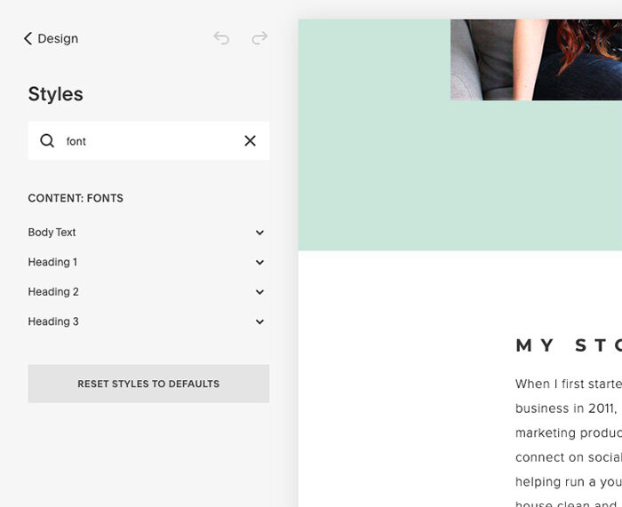
It’s amazing what a difference a font headline can make in the overall appearance of your page. It’s really fun to experiment with different the three Headline fonts. To change yours go to Design > Site Styles and search for fonts. Settings for these three headlines should pop up. Don’t forget to change up the spacing!
Here are a few of my favorite pairings…
Futura + Proxima Nova
Bebas Neue + Josefin
Playfair + Open Sans
Raleway + LTC Bodoni 175
Montserrat + Baskerville URW
#5 Add Related Blog Posts
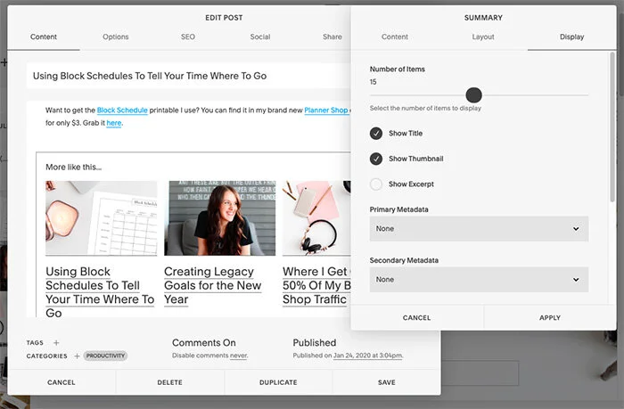
If you have a blog on Squarespace, you probably want your readers to stick around after reading through the latest post. To make that happen, you can refer them to related posts using a Summary Block.
Here’s how to set one up. Add the Summary Block titled Carousel.
Now in the Carousel settings you can choose how you want it to appear.
In the Content tab, under Blog, click on All Posts.
In the Layout tab, you can customize your headline text to say “Related Posts” or “More Like This.”
You can also choose the size of your images and how you want the text to look.
In the Display tab, you can choose display options like how many posts you want them to scroll through and what to show.
At the bottom, you can also type in a tag or category filter to show only posts that relate to the topic you’re posting about.
There you have it! A perfectly personalized design with absolutely zero coding.
I hope that spurs you on for ideas on how you’ll customize your Squarespace site.
Let me know if you have any fun code-free hacks to share in the comments!


